
Challenge
My challenge was to create an information visualisation in the form of a static information graphic.
Solution
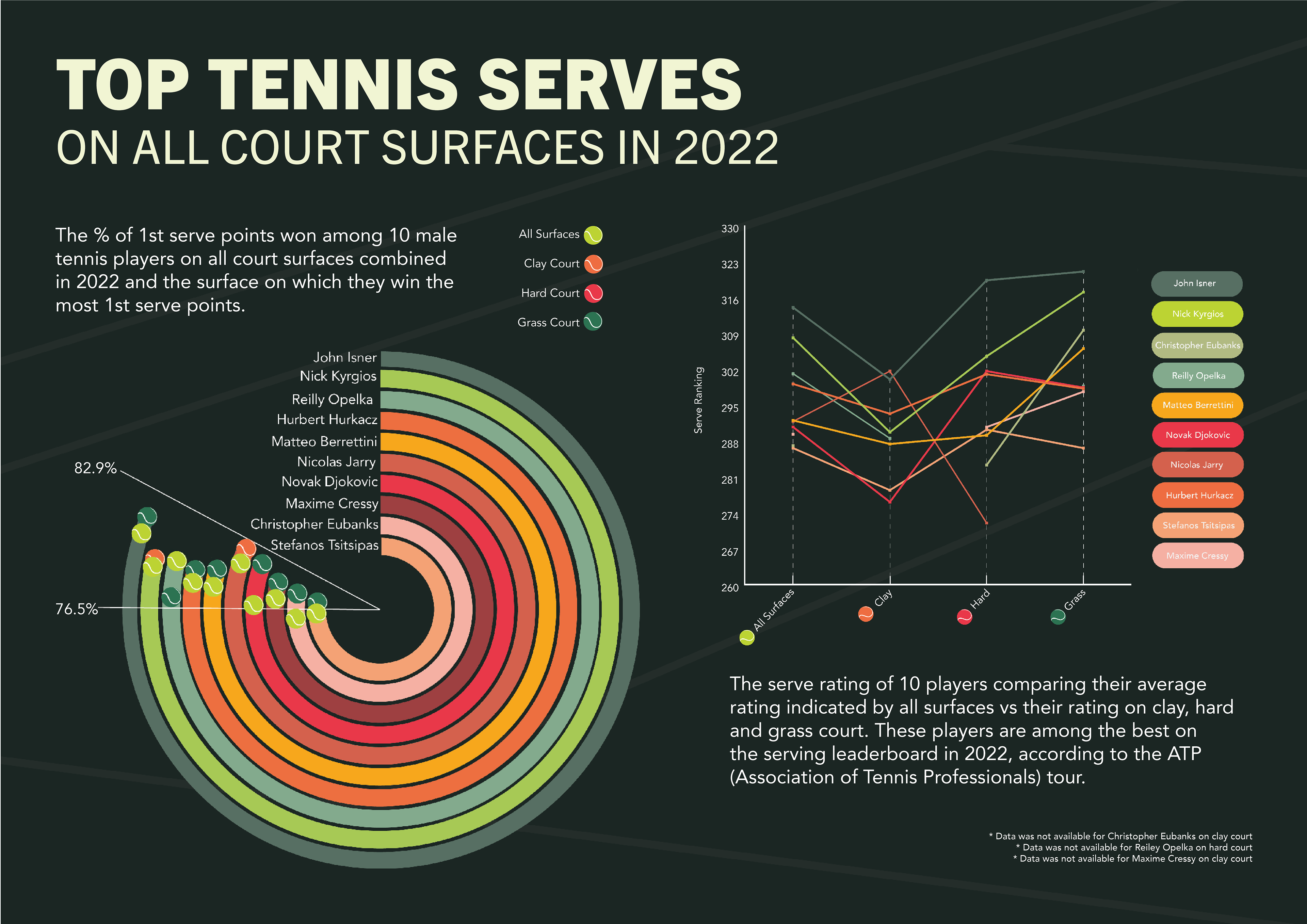
For this project, I created a static information graphic that visualises data from the ATP (Association of Tennis Professionals) Tour. The focus was on the tennis serve statistics of ten male tennis players in 2022. The circular graph presents the average percentage of first-serve points won across all surfaces, as well as the court surface where they perform their best. Additionally, the line graph shows the average serve rating of each player on each court surface, allowing for a more in-depth analysis of the data.
Created 2023