Challenge
To create a visual brand and identity system for an envisaged property development company or property development.
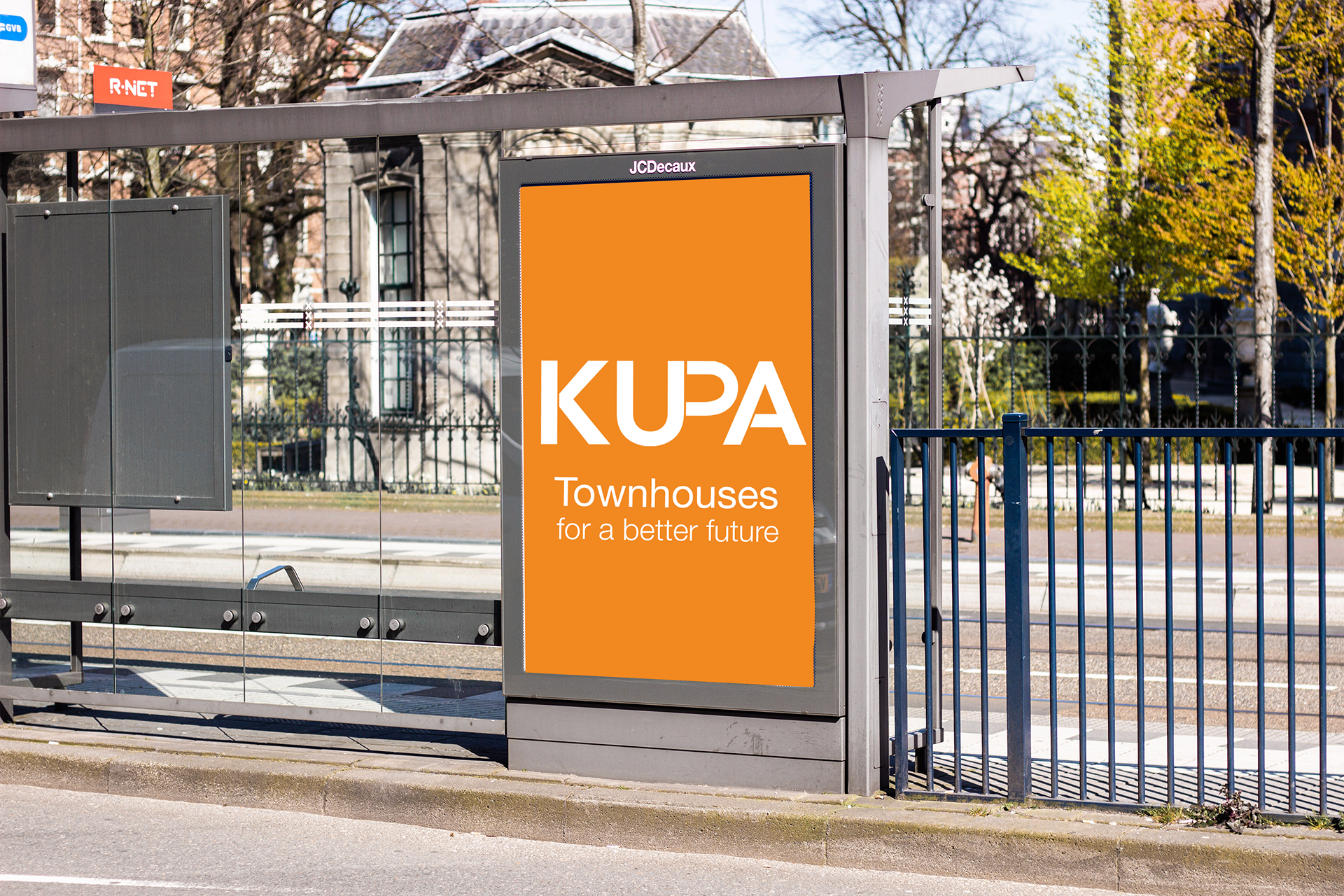
Solution
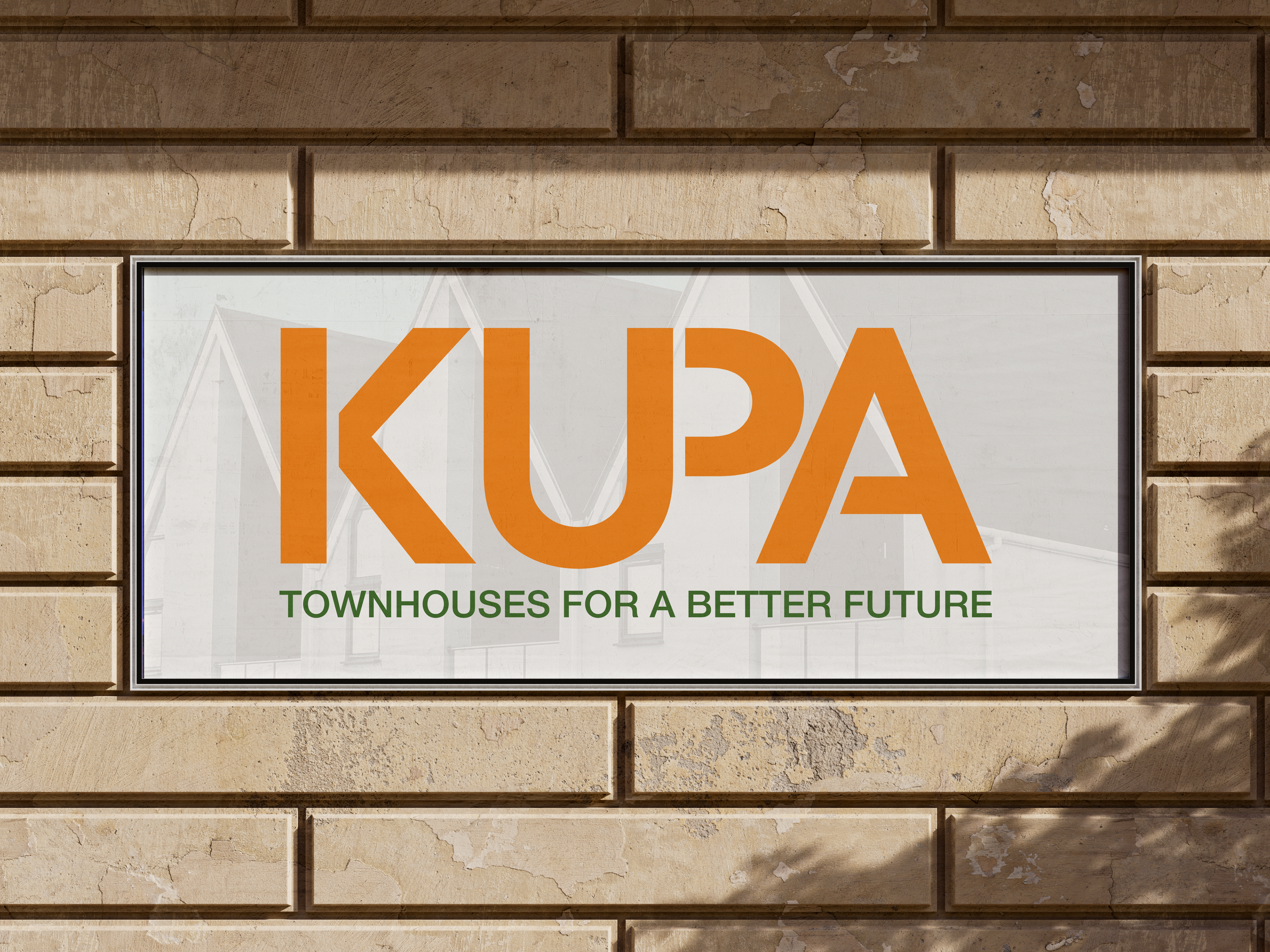
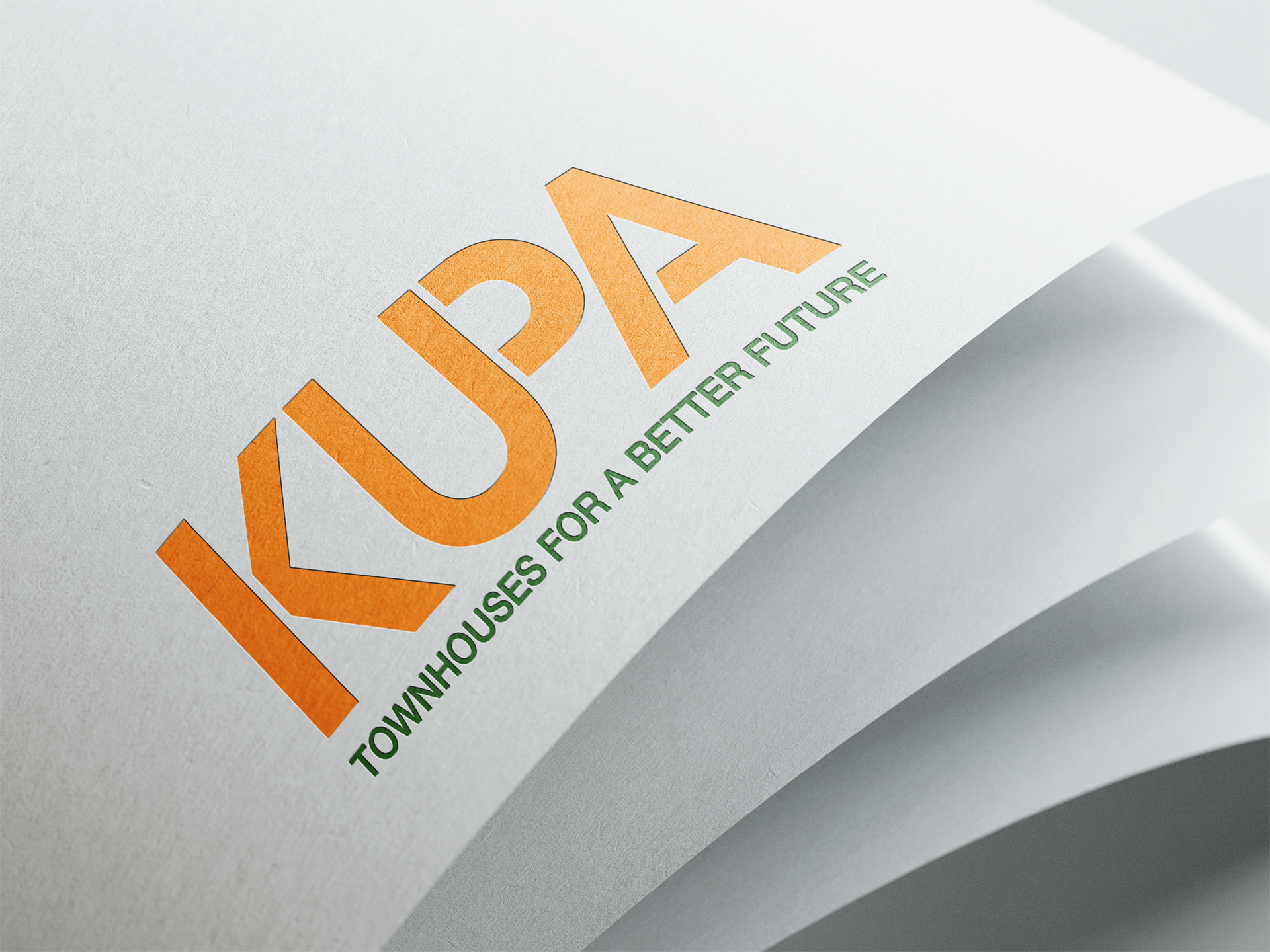
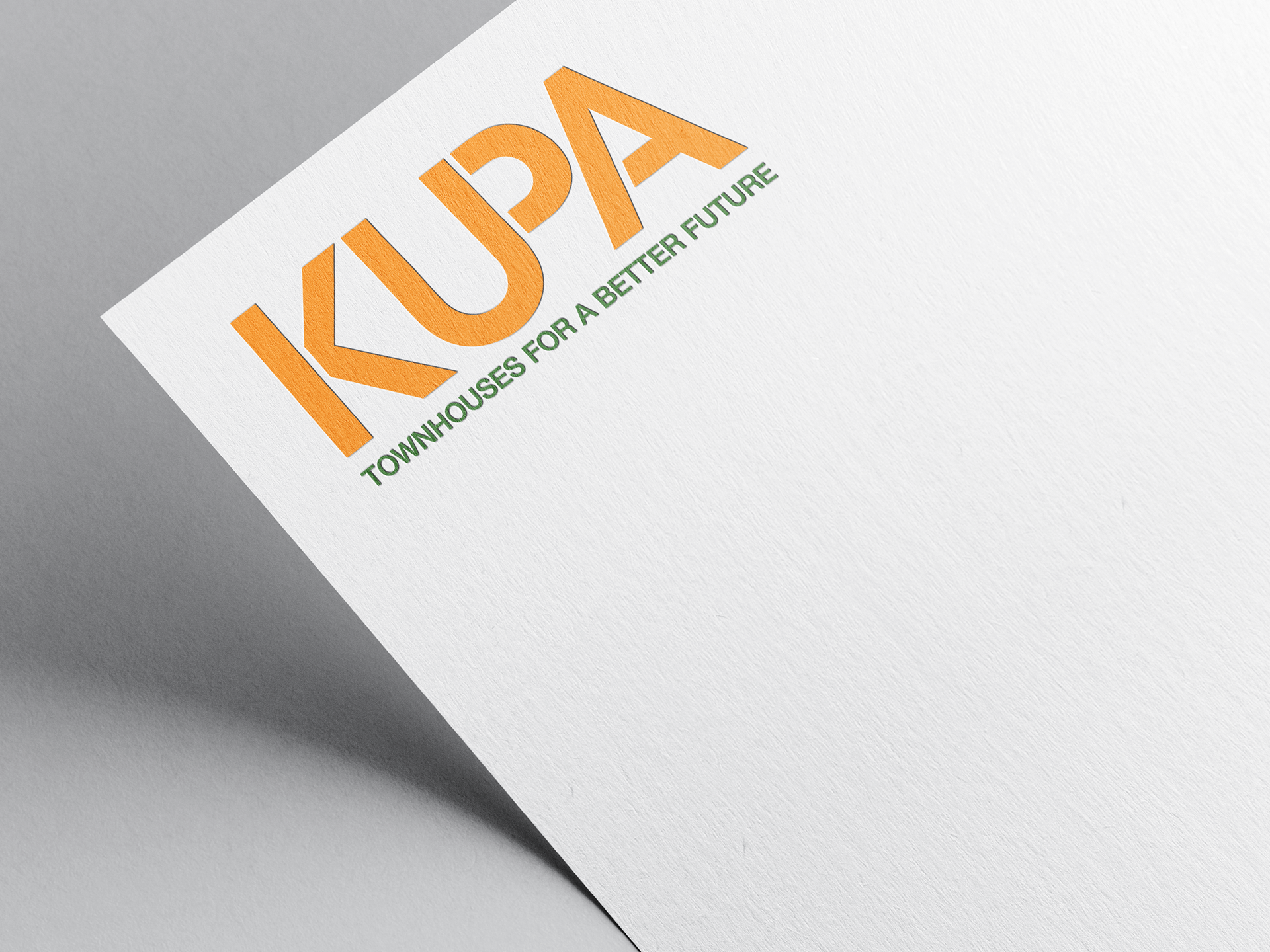
Kupa Townhouses is an envisaged property development based in Canberra. These residences are designed for the young demographic in Canberra looking to become first home buyers who want to enter the housing market. It focuses on sustainability and affordability due to Australia's current housing affordability crisis. Kupa means hive and represents a tight knit community of residence. I used the colour orange to represent harmony and green to represent sustainability and the environment where the properties are located.


Created 2022